Buying a hostel is one thing, to make our mark on it we decided to re-brand. That sounds a bit corporate, but what it boils down to is that we want it to be “ours”. That meant that we needed a new name, a new logo and a new website.
First the name – we agonised for days over various combinations of words. We wanted “mountain” to feature in it and hoped to attract more cyclists as guests so Helen had a flash of inspiration to add “saddle”. Obviously it refers to bike saddles, but it’s also a geographical feature. Go South on the A82 along Loch Lochy and on your right there is a perfect example of a mountain saddle. There’s a photo of it on our home page, taken from the glen behind it.
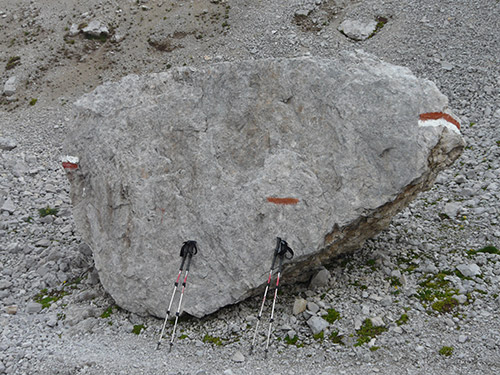
Next came the logo. After spending years on holiday following red and white paint signs along the GR trekking routes of Europe we wanted those colours to be our theme. You’ll see them all through the hostel. By coincidence, Helen’s brother David is a graphic designer. We gave him the name and the colour scheme, he came up with the basic idea, and (eventually) we were all agreed on the Saddle Mountain logo. David also came up with the design of the “Whompass”. That’s our hybrid bike wheel/compass. The idea is supposed to signify our love of cycling and the fact that the hostel is ideally located for activities in all directions.
Finally the website. As it happens our old friend Neil Huggan (New Makar) does website design work. He has worked in the logo and the red/white colour scheme to make us what we think is a dynamic and modern and beautiful looking website.
Maybe you think that design doesn’t matter, but we don’t just want to run a hostel that is a great place to stay. We want it to look good too. After all, we live here ourselves.

